/ home
MENU

Premium web design builds trust, elevates perception, and turns casual visitors into confident clients.

In today’s crowded digital space, first impressions are everything. A user might land on your site and decide within seconds whether to stay, explore, or bounce. This snap judgment isn’t just about what you say—it’s about how you present it. A truly premium website doesn’t just look good; it feels intentional, refined, and trustworthy. But what exactly gives a website that high-end, premium feel?
Premium web design is not defined by trends or gimmicks. It’s about precision, restraint, and clarity. It reflects a brand’s identity in a way that feels confident and cohesive. Whether you’re a luxury brand, a bespoke service provider, or a business that simply values quality, a premium site tells your visitors: we care, we’re professional, and we’re worth your time.
When users land on your homepage, they’re subconsciously asking themselves a few key questions: Can I trust this brand? Does this feel professional? Do I want to learn more? The design, layout, and mood of your website answer those questions before a single word of copy is read.
A premium website feels smooth, organized, and thoughtfully structured. There’s visual breathing room. The design is neither cluttered nor chaotic. The flow is intuitive. Every visual and interactive element has a clear purpose. This immediate sense of quality builds trust and encourages deeper engagement.
At the heart of every premium site is a sense of simplicity—not minimalism for the sake of looking clean, but design that removes distraction and focuses attention. Navigation is easy and unobtrusive. Content is prioritized. Whitespace is used deliberately to create balance and flow. The overall effect is calming and confident, not loud or pushy.
Simplicity in a premium site also means clarity. The user should know what you do, who it’s for, and how to take the next step without digging or guessing. That might mean a clear call to action, well-organized service sections, or concise but meaningful copy that communicates value quickly.
One of the most overlooked aspects of premium design is typography. Fonts do more than display text—they convey personality. A luxury brand might lean into elegant serif fonts with generous spacing. A high-end tech company might choose sleek, modern sans-serifs with subtle geometric traits.
Font pairing is equally important. Premium sites often use a restrained palette—one or two typefaces used consistently across headings, body text, and buttons. Line height, letter spacing, and font weight all contribute to legibility and style. Typography sets the tone and creates rhythm, helping users feel the brand before they consciously analyze it.
Color choices in premium web design are rarely loud or oversaturated. Instead, they tend to favor muted, sophisticated tones or strong contrasts used sparingly. Black and white with accents of gold, navy with soft greys, or deep earth tones can all communicate refinement, stability, or modernity.
More importantly, premium color palettes are consistent. They support brand identity and create a visual hierarchy that helps guide the user’s eye. Strategic use of color can highlight calls to action or create emotional warmth. When color is used with purpose, it becomes part of the storytelling, not just decoration.
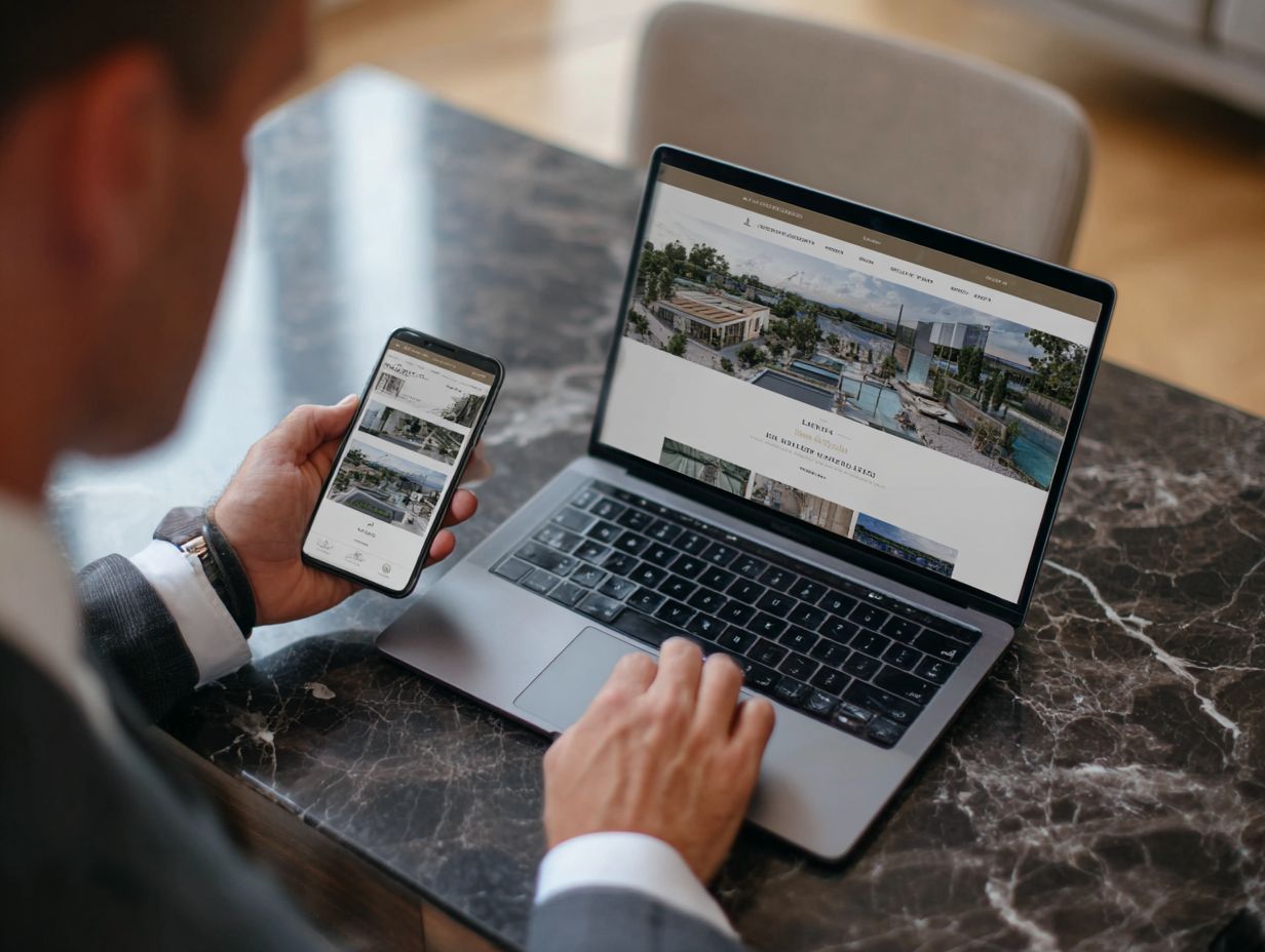
A premium website never relies on generic stock imagery. The visuals feel bespoke, polished, and on-brand. High-resolution photography, cinematic lighting, and consistent editing style all signal attention to detail.
Custom photography, especially of products, spaces, or people involved with the brand, creates authenticity. It reassures users that the business is real, confident, and invested in quality. When custom photos aren’t possible, carefully curated stock that aligns with the brand tone is the next best option.
Beyond photography, icons, illustrations, and even background textures should all feel considered. These elements shouldn’t just fill space—they should elevate the narrative and contribute to a cohesive visual language.
Subtle animations and transitions can add a sense of polish and interactivity that enhances the premium feel. Microinteractions—like a button gently responding to a hover, or a section fading in as you scroll—make the site feel alive and responsive.
But restraint is key. Overly flashy animations can feel amateurish or distracting. Premium design uses motion sparingly, in service of the user experience. The goal is to create delight and momentum, not to overwhelm.
Premium websites don’t overwhelm users with too much information up front. Instead, they reveal content in a thoughtful sequence. The structure often mirrors a storytelling arc: starting with a bold introduction, then unfolding the details, and ending with a clear, persuasive call to action.
Content is broken into digestible sections. Layouts avoid long blocks of text, favoring visual variety: images beside copy, short quotes, icon lists, or layered sections. The result is a smooth scroll experience that feels dynamic without being chaotic.
Responsive Design that Feels Native
A premium site feels just as polished on mobile as it does on desktop. It doesn’t just shrink down—it adapts. Menus are rethought, touch interactions are optimized, and layout changes enhance readability. The mobile experience is smooth, quick, and deliberate.
Responsiveness isn’t just a technical feature—it’s a signal that the brand cares about every visitor, regardless of how they access the site. In premium web design, mobile is never an afterthought.
Ultimately, what makes a website feel premium is how well it communicates the brand’s essence. The best high-end websites don’t try to be everything to everyone. They understand their audience and speak directly to them.
That emotional alignment comes from visual harmony, tone of voice, and intentional design decisions. When every element—from the header font to the footer spacing—feels aligned with the brand’s personality, the result is a site that doesn’t just look premium. It feels like it couldn’t belong to any other business.
Users don’t always articulate why a website feels better than another. They just know it does. That subconscious response can mean the difference between a bounce and a conversion. A premium site builds trust, positions your brand as a leader, and gives users confidence that you’re the right choice.
In competitive markets, especially luxury, creative, or bespoke industries, your website is often your first and most important point of contact. If it feels thoughtful, beautiful, and clear, that impression sticks. And in a space where perception drives decisions, that impression is everything.
Premium web design isn’t about being flashy. It’s about being intentional. It’s about caring how your brand is perceived and respecting the user’s time and attention.
By focusing on clarity, cohesion, and emotional impact, you create a site that doesn’t just inform—it resonates. And that feeling of quality, trust, and refinement? That’s what makes a website feel premium. And that’s why it matters.
Explore Real Strategies, Trends, and Tips to Help Your Brand Grow.