/ home
MENU

ChatGPT said: Modern web design blends style with substance — trends should elevate clarity, usability, and performance.

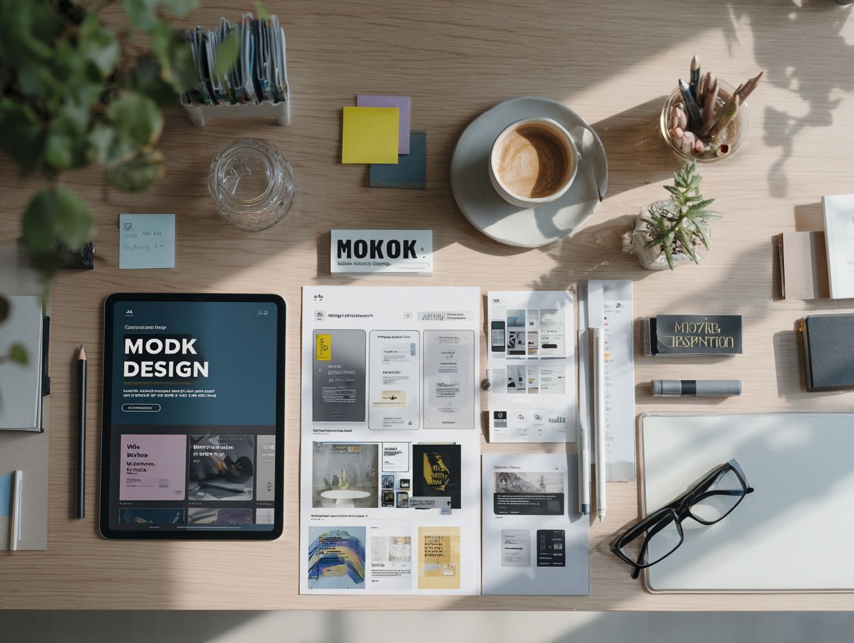
In the fast-moving world of web design, trends come and go like the seasons. One year it's all about brutalism, the next it's immersive 3D. But for business owners and designers who care about performance and results, the real challenge is this: how do you stay modern without compromising clarity, speed, or usability?
Trends matter because they reflect cultural shifts, technological advances, and evolving user expectations. But not every trend is worth chasing. A good designer doesn’t just follow trends — they understand them, interpret them, and apply them with purpose. In this post, we’ll explore the current web design trends worth watching and examine what actually works when the goal is creating websites that look great and perform even better.
Minimalism has long been a pillar of clean, user-friendly web design. But in recent years, it's evolved beyond sparse white pages and Helvetica. Today’s minimalism is warmer, more layered, and more visually engaging. Instead of stripping everything away, it’s about reducing clutter while still communicating personality.
We’re seeing more sites using soft color palettes, generous spacing, subtle textures, and expressive typography. The goal isn’t just simplicity for its own sake — it’s clarity. Designers are creating calm, focused experiences where content has room to breathe and the interface supports rather than distracts.
This trend works because it aligns with how people process information. Less visual noise leads to better comprehension. And when minimalism is paired with thoughtful visual hierarchy, it becomes a tool for storytelling and conversion.
Scrolling has become the new clicking. With the rise of mobile and touch interfaces, users are more comfortable than ever navigating by scroll. Designers are taking advantage of this by introducing scroll-triggered animations, transitions, and content reveals.
When done well, scroll interactions make a site feel alive. They help guide users through content, create narrative pacing, and highlight important elements at the right moment. They can also add moments of delight — small surprises that keep users engaged.
The key is restraint. Too much movement can be distracting or disorienting. Successful scroll-based interaction is smooth, purposeful, and always enhances rather than competes with the content.
Once a niche feature for techies, dark mode is now mainstream. It reduces eye strain, saves battery on OLED screens, and — when designed well — looks undeniably sleek. Many websites are offering either full dark interfaces or light/dark toggles that let users choose.
This trend reflects broader design shifts toward accessibility and customization. Dark themes often use high contrast, deep tones, and pops of accent color to create atmosphere while maintaining legibility. They can feel luxurious, modern, or technical depending on the palette.
What works best is ensuring readability and contrast are maintained. Text should always remain legible, and UI elements should retain enough definition to support usability in low-light environments.
Typography is no longer just a vehicle for text. It’s become a design element in its own right. Bold, expressive typefaces are taking center stage in hero sections, branding statements, and headlines.
Designers are playing with scale, layering, and motion to bring type to life. Oversized serif fonts, fluid sans-serifs, and custom lettering all help brands communicate personality in a split second.
This trend works especially well when combined with minimalist layouts. The contrast between big, character-rich type and clean backgrounds creates instant impact. The key is balance — pairing expressive typography with strong readability ensures the message still comes through.
Perfect grids can feel sterile. Today’s designers are embracing asymmetry and more organic layouts to create visual interest and dynamism. Instead of a rigid left-to-right structure, content flows more freely — overlapping sections, off-center imagery, and varied alignment all contribute to a more modern, human feel.
This trend reflects a shift toward storytelling and personality. Asymmetrical design can guide the eye in less predictable ways and create a sense of movement. It also mimics how people naturally view content — not always in perfect columns, but through exploration.
What makes this trend work is intentionality. It’s not about being chaotic. The best asymmetrical layouts still have rhythm, balance, and clear hierarchy — they just break the rules selectively for creative effect.
Flat design had its moment, but now we’re seeing a return to depth — subtly. Designers are using soft shadows, layered elements, floating cards, and overlapping shapes to create dimensionality without overwhelming the interface.
These effects mimic real-world behavior (like light and motion) and help separate content into clear visual zones. Cards that lift slightly on hover, images that overlap headlines, or layers that animate gently into view all contribute to a sense of tactility.
This trend works especially well on modern displays and supports the user’s sense of orientation. It adds polish and makes interfaces feel more responsive and intuitive.
Microinteractions are the tiny feedback moments that respond to user actions — a heart that fills when liked, a button that glows on hover, or a smooth toggle between views. While small, they can make a huge difference in how a site feels.
These interactions signal that the site is paying attention. They offer visual reassurance and help users feel in control. They also introduce moments of personality and brand tone without needing large animations or banners.
What makes microinteractions effective is subtlety and consistency. They should feel natural, responsive, and emotionally satisfying without slowing down the experience.
There’s growing awareness around sustainability in web design. Sites with heavy images, video, and bloated code not only load slowly but consume more energy. Designers are now prioritizing performance — optimizing assets, reducing third-party scripts, and favoring cleaner code.
Lightweight design isn’t just good for the planet. It’s good for SEO, mobile usability, and accessibility. This trend is less about a look and more about an ethic — valuing speed, clarity, and resource efficiency.
A fast site feels premium, trustworthy, and professional. It reflects care in execution and respect for the user’s time.
More sites are adapting to user behavior, preferences, or location in real-time. From personalized greetings to dynamic content suggestions, adaptive design can make the experience feel more relevant and tailored.
This doesn’t always require complex AI. Even small touches like remembering a user’s theme preference or surfacing related blog posts can increase engagement. It shows that the site is paying attention and providing value.
This trend works when it enhances without being invasive. Transparency, control, and thoughtful implementation are essential to building trust.
Accessibility isn’t a trend — it’s a requirement. But more designers are treating it as a core part of creativity rather than a compliance box. Accessible sites are better for everyone, and the tools that support accessibility — like high-contrast colors, readable type, and keyboard-friendly layouts — often lead to cleaner, more effective designs overall.
Designers are now embracing inclusive thinking from the start. This includes using semantic HTML, designing for screen readers, and ensuring all interactions work without a mouse.
What works best is when accessibility is baked into the aesthetic — making beautiful, on-brand experiences that are welcoming to all users.
Not all trends are worth embracing. Some look flashy but harm usability or performance. Full-screen video backgrounds, autoplay audio, excessive parallax, and overly abstract navigation often frustrate users more than they impress them.
Design should always serve a purpose. If a trend doesn't align with your brand or help your audience, it's better to leave it out. The best designs balance creativity with clarity.
Web design trends offer inspiration, but they shouldn’t drive the entire process. Great design is rooted in strategy. It starts with understanding your users, your goals, and your message — then using trends as tools to bring those things to life.
By staying aware of what’s emerging and applying it with intention, you can create websites that feel modern without being trendy. The result is a digital experience that’s not just beautiful — it’s smart, accessible, and built to last.
Explore Real Strategies, Trends, and Tips to Help Your Brand Grow.
